New year, new reaction buttons - or at least, that's what we're hoping for!
We have decided to follow in the footsteps of DEV, by giving the unicorn reaction button a well-deserved rest. RIP 🦄 friend.
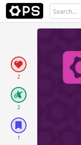
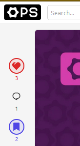
This was in part guided by the Forem team's awareness that users have to scroll through the entire post to reach the comments section, and in part because people have been confused about the unicorn reaction since time immemorial. They resolved both issues by replacing the unicorn for a jump-to-comments button, as you can see in the sidebar of this post and in the screenshots below.
Before:
After:
Note how the new reaction buttons have a comments button in place of the unicorn, which will jump you directly to the comment section. 🗨
As explained in the DEV post, there will eventually be more reaction buttons to replace the unicorn, but for the time being we are moving into 2023 with the comments button...
What do you think?
🦄 Will you miss the unicorn?
🗨 Will this will make it easier to comment on posts?
🗨🦄 Why not both?


Top comments (4)
I think this is a good change. The idea behind the unicorn was good, although I think it is better to have more distinct features available, the difference between heard and unicorn could perhaps be a bit fuzzy.
Ngl, I'm partial to the unicorn myself, but I do find myself spamming both heart and unicorn together a lot because unicorn alone feels a bit like I'm not actually "liking" something. I'm pretty sure that's not how it's supposed to work, so I'm just jacking up everyone's reaction scores... 😂
Looking forward to a system that's more like LinkedIn, where I can choose just the one reaction that best fits how I want to interact with the post.
Yes, I sometimes use both unicorn and heart, and sometimes one of them only. Not being particularly consistent, so better with a system where only one reaction can be chosen.
It looks like consensus from The Ops Community is to programmatically constrain our very human inconsistencies - is anyone surprised?