Organisations depend on data visualisation tools to make informed decisions and gain insights into their operations. Azure provides a suite of powerful options, including Azure Dashboards, Azure Workbooks, and Power BI. Although all these tools are designed for visualising data, each has distinct features and specific use cases. In this blog post, we'll delve into the differences between these tools and highlight the scenarios where each one excels.
Azure Dashboards
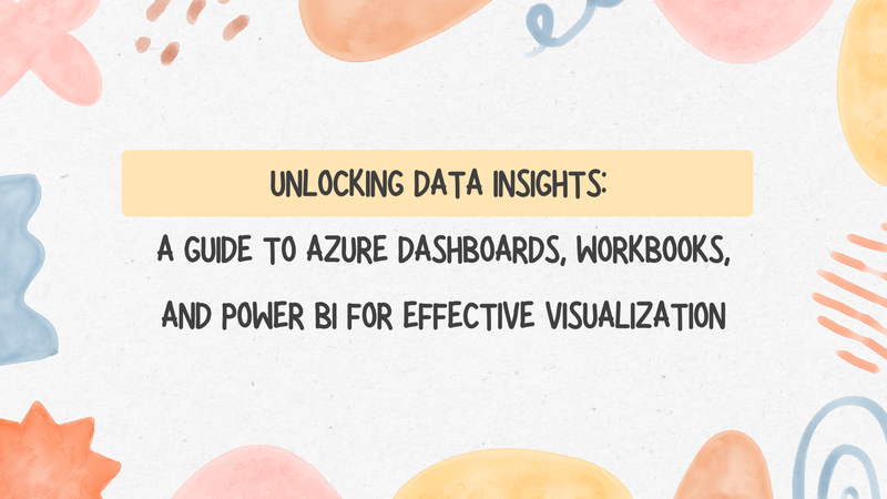
Azure Dashboards give you a customisable canvas for monitoring your Azure resources and other external data sources. They allow you to create dashboards with widgets that display metrics, charts, and other visualisations that are important to you and your team.
Subset of Infra Specialists transitioning to the Desktop Virtualisation team"
Azure Dashboard example
Azure Dashboards are primarily focused on real-time monitoring and offer a quick and easy way to track the health and performance of your resources. Dashboards aren’t designed to be very interactive, but they can refresh regularly and give you a view of what is happening in your environment.
Key Features:
- You can create dashboards tailored to your specific monitoring needs by adding and arranging widgets.
- Azure Dashboards seamlessly integrate with various Azure services, allowing you to monitor metrics from Azure Monitor, Azure Resource Graph, Application Insights, and more.
- Dashboards provide real-time updates, enabling you to monitor changes and respond quickly to issues.
Use Cases:
- Monitoring the performance and health of Azure resources such as virtual machines, databases, and web apps.
- Tracking key metrics and KPIs for business operations and services hosted on Azure.
- Creating executive dashboards for high-level visibility into organisational performance.
Azure Workbooks
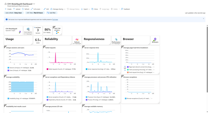
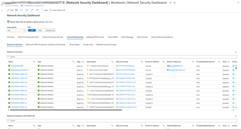
Azure Workbooks also give you a blank canvas you can customise. The workbooks can provide an interactive way to view and analyse data. They provide an area where you can create rich interactive reports using data from various sources, including Azure Monitor, Log Analytics, and custom data sets.
Azure Workbook example
Key Features:
- Azure Workbooks offer a wide range of interactive visualisation options, including charts, tables, maps, and logs, to help you analyse and interpret your data effectively.
- Workbooks can pull data from multiple sources, allowing you to combine data sets and perform advanced analysis.
- You can share your workbooks with colleagues and stakeholders, enabling collaboration and knowledge sharing.
Use Cases:
- Analysing performance and usage trends across multiple Azure services and environments.
- Investigating and troubleshooting issues using log data and metrics from Azure Monitor and Log Analytics.
- Filtering and interacting with the data to produce data that gives you the insights that you need.
Power BI
Power BI is a business analytics tool that enables organisations to visualise data, share insights, and make data-driven decisions. It offers advanced features for data modelling, analysis, and visualisation, making it suitable for a wide range of business intelligence scenarios.
Power BI report example
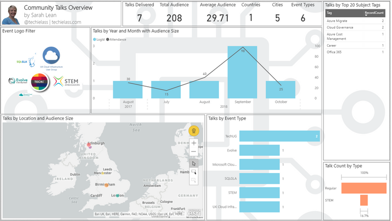
Key Features:
- Power BI provides data modelling capabilities, allowing you to create relationships between different data sources and perform complex calculations.
- With Power BI, you can leverage advanced analytics features such as predictive modelling, clustering, and forecasting to uncover hidden insights in your data.
- Power BI offers a vast library of visualisation options and customisation tools to create visually stunning and interactive reports and dashboards.
Use Cases:
- Building interactive reports and dashboards for business users to explore and analyse data from various sources.
- Performing ad-hoc analysis and exploration of large datasets to identify trends, patterns, and outliers.
- Creating data-driven applications and embedding analytics into custom applications and websites.
Choosing the Right Tool
When it comes to choosing the right tool for data visualisation in Azure, it's essential to consider your specific requirements and use cases. Here's a quick summary to help you decide:
- Azure Dashboards are best suited for real-time monitoring and tracking of Azure resources and services.
- Azure Workbooks excel in analysing and visualising data from multiple sources, making them ideal for interactive in-depth analysis and reporting.
- Power BI is the go-to choice for comprehensive business intelligence and analytics, offering advanced features for data modelling, analysis, and visualisation.
Conclusion
In conclusion, Azure provides a diverse set of tools for data visualisation, each serving its own purpose and catering to different needs.
Whether you need real-time monitoring, in-depth analysis, or comprehensive business intelligence, Azure has the right tool for the job.
By understanding the differences between Azure Dashboards, Azure Workbooks, and Power BI, you can choose the tool that best fits your requirements and empowers you to derive actionable insights from your data.

Top comments (4)
Given the overlap in functionality between Incredibox, Azure Workbooks, and Power BI for deep data analysis, when do you think it makes sense to move from Workbooks to Power BI rather than continue to extend Workbooks? Are there any specific criteria you typically use?
Hi Sarah lean,
Great topic! When it comes to unlocking data insights using Azure Dashboards, Workbooks, and Power BI, each tool offers unique advantages depending on your specific needs.
Azure Dashboards: Ideal for real-time monitoring and quick, at-a-glance views of your system’s performance. You can customize dashboards to display the most critical metrics, making it easier to stay on top of key performance indicators (KPIs).
Azure Workbooks: Perfect for interactive exploration and detailed analysis. Workbooks allow you to combine data from multiple sources, apply custom queries, and create more sophisticated visualizations. It’s a powerful tool for diving deeper into your data.
Power BI: Best for creating comprehensive reports and sharing insights across your organization. Power BI excels in data transformation and offers a wide range of visualization options, making it the go-to tool for presenting data in a polished and professional manner.
For a practical implementation, I’ve integrated these tools into my business operations at SK Print & Signage (skprint.com.au/). This combination has significantly improved our ability to make data-driven decisions, especially when it comes to analyzing market trends and operational efficiency.
If anyone has further questions or needs more detailed examples, feel free to ask!
Excellent subject! Each tool has distinct benefits when it comes to utilising Azure Dashboards, Workbooks, and Power BI to access data insights, based on your particular requirements. crazy cattle
It offers a diverse set of useful tools. ragdoll hit