
Charting can be complicated and intimidating, especially when dealing with web performance data, flame charts, and percentiles. There is so much data crammed together! Why are the numbers all different?! Let’s break down these charts, what they are good for, and when to use them.
Flame Charts
A flame chart uses a stacked colored bar chart to show both the number of users and their performance for a given time. It is usually a histogram, showing how the data changes over time. Here’s an example of a flame chart from a Request Metrics page load performance report.
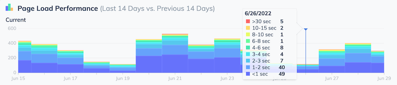
Each bar (or flame) shows the total number of visits to the page. The relative size of each color shows the performance experienced by users. Cooler colors usually mean “faster” performance, while warmer colors are slower.
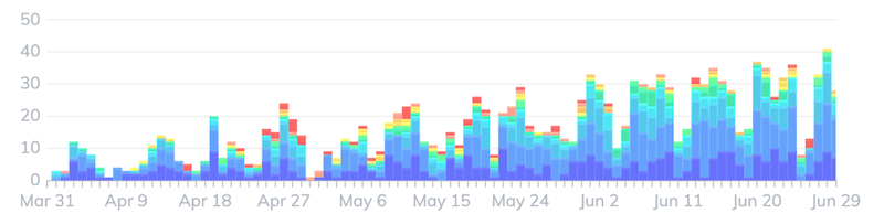
Flame charts are useful to see big changes in your performance. For example, the flame chart below shows the last 90 days of load performance data for a page. The increasing size of the flames shows that the traffic is increasing each week. The flames are also getting warmer, with less blue and more red, telling us that the page is slowing down under the increased traffic.
Flame Charts Are Bad for Small Changes
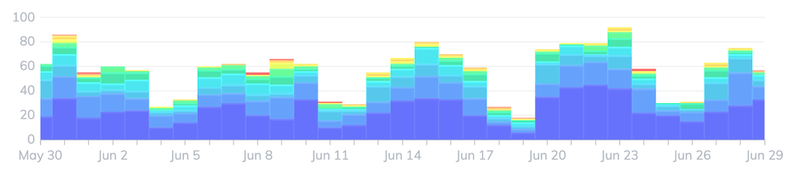
Flame charts are a great tool for showing big trends, but it can be hard to spot subtle changes in them. It’s difficult for most people to spot small changes in a color distribution. Take this flame chart for instance. There was a performance improvement made around June 20th. Can you spot it? I can’t.
This is where percentiles become really useful.
Percentiles
Hang on, we’re going to channel some of that 7th grade math class you slept through. Let’s say you’ve gathered a bunch of time-to-load performance data. If you sort that data from fastest to slowest, it might look like like the table below.
| Load Time | |
|---|---|
| 1s | |
| 1s | |
| 1.5s | |
| 1.6s | |
| 1.7s | Median |
| 2.2s | |
| 3.1s | |
| 3.7s | 75th percentile |
| 4.1s | |
| 12s | 95th percentile |
The value that fits in the “middle” of the data, so that half of the data is faster and half is slower, is called the median , or 50th percentile. This value is useful because it says, “half of my users had performance better than this”.
The 75th percentile, or 75% of the data is faster, is very useful for web performance data because it shows you what most users will see as the worst-case.
The 95th percentile, where 95% of the data is faster, shows us what the slowest users experience.
Why not use the slowest data?
A lot of crazy stuff happens on the web. The slowest data in most real-world reporting is usually unrealistically slow. It’s often bad data being reported from bots, bugs, or suspended pages: generally stuff you don’t care about. Using the 95th percentile trims off this bad data and gives you the slowest realistic performance experience.
Let’s look back at our “small change” example. If we chart the data as percentiles rather than a flame chart, we can see smaller patterns. In this example, load time performance gets a touch faster on June 20th.
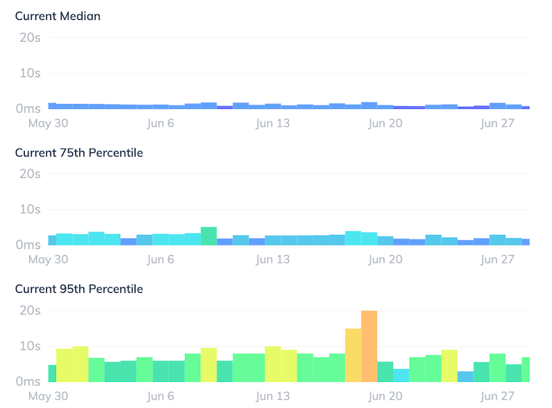
This pattern is visible on all three charted percentiles, so the page got a touch faster for everyone. Nice work team.
The danger of averages
When trying to interpret a pile of data, it is tempting to look at the averages, but this can be very misleading. Averages will smooth out interesting patterns and hide the true experiences of the fastest and slowest users.
The average load time for the data is about 3.2 seconds, a time that doesn’t really reflect the fastest users, slowest users, or even the majority of users. Producing a few percentiles is much more informative.
Check out more about the averages and performance statistics in chapter 2 of the Definitive Guide to Measuring Web Performance.
Why gather the data and do the math yourself though? This is what Request Metrics is made for! Let us report on your end user performance and give you exactly the reports you need to make your website fast. I bet you’ll love it.

Latest comments (0)