Images engage users, drive clicks, and generally make everything better--except performance. Images are giant blobs of bytes that are usually the slowest part of your website. This 2022 guide has everything you need to know for fast images on the web.
Images are big. Really big. The bytes required for an image dwarf most site's CSS and JavaScript assets. Slow images will damage your Core Web Vitals, impacting your SEO and costing you traffic. Images are usually the element driving Largest Contentful Paint (LCP) and load delays can increase your Cumulative Layout Shift (CLS). If you're not familiar with these metrics, check them out in the Definitive Guide to Measuring Web Performance.
This guide covers optimizing your image format, resolution, quality, as well as embedded images and lazy-loading. Let's get started!
1. Image Format
First and foremost, your images need to be in the correct format. Image formats are designed for a particular kind of image, so using the wrong format can make a big image even worse.
A good general rule is to use jpg for photographs and use pngs for graphics. Here's a quick example:

On the left is a photograph of our buddy Sam, the sloth. As a JPG, the file is only 32.7 kilobytes. Convert the same file to a PNG, and it more than doubles to 90.6 kilobytes!
The right is an illustration of Sam, and is better served as a PNG. It's only 5.5 kilobytes. But converting it to a JPG balloons it to 11.3 kilobytes.
Note that graphic illustrations tend to be significantly smaller than photographs. Be sure to consider this when designing the look and feel of your pages.
There's lots of other formats too! If you have artwork as vectors (lines and paths), SVG is a perfect format. Newer browsers support newer formats as well, like AVIF and WebP, which might be even smaller.
2. Responsive Image Resolution
Your website will not be viewed the same way by everyone. Some of your users will have a huge 1600px wide display. Others may have a 900px tablet or a 600px phone. A 1200px wide image would need a lot of wasteful bytes for those smaller devices, where the image will get scaled down anyway.
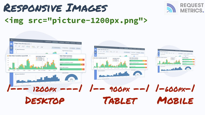
Why not scale down the images before your users download them? Use HTML responsive attributes to describe the sizes available for an image, and when to use them.
<img src="picture-1200.jpg"
  srcset="picture-600.jpg   600w,
          picture-900.jpg   900w,
          picture-1200.jpg 1200w"
  sizes="(max-width: 900px) 100vw, 1200px"
  alt="my awesome picture" height="900" width="1200" />
In this case, the base image is 1200px wide, and that's also the default src. The srcset defines 3 images at 600, 900, and 1200px wide. The sizes uses CSS media queries to hint the browser on the viewable size available for the image. If the window is less than 900px wide, the frame will be fullwidth, 100vw. Otherwise, the frame will never be bigger than 1200px wide.
Most image tools, like Photoshop, Gimp, and Paint.NET, can export images at multiple resolutions. Your native image viewer can probably do some limited resizing as well. To automate this on a large scale, you may want to consider a command line tool like ImageMagick.
Hiding Images on Mobile
For some websites, you may not want to show an image on mobile devices at all because they are simply too big. Setting a display:none style on the image isn't very helpful because the browser will still waste time and bytes downloading the image. Instead, you can use sizes to tell the browser when the image will not be shown.
<img src="picture-1200.jpg"
  srcset="picture-600.jpg   600w,
          picture-900.jpg   900w,
          picture-1200.jpg 1200w"
  sizes="(max-width: 600px) 0, 600px"
  alt="my awesome picture" height="900" width="1200" />
For screen sizes less than 600px, the frame of the image is 0px wide. So the browser knows it doesn't have to bother downloading anything because there is nothing to show.
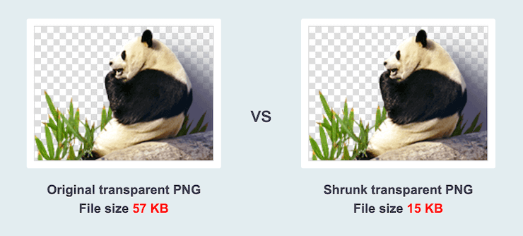
3. Image Quality
Aside from image format and resolution, there are often settings to adjust the quality of the image using lossy compression. These are algorithms that remove parts of an image that you wouldn't notice, but still take up space. Check out this example:
This reduction is accomplished by pulling out unused colors, or by combining colors and pixels that too similar to notice. But you don't need to worry about that, most optimization tools can detect the appropriate level of quality for an image. TinyPNG and ImageMin are great for this.
4. Embedding Images
Sometimes an image is essential for a webpage to be useful, such as a button, logo, or icon. Once you've optimized it as small as you can make it, the only way to go faster is to embed the image on the page. This will save a network request and show an image as soon as the document starts rendering.
You embed an image by converting it into a base64 string and putting it right in the html tag, like this:
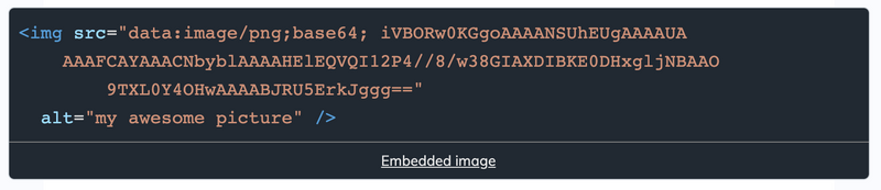
This may look strange, but it's 100% supported as a data url. The src defines the format as a PNG image thats base64 encoded. The remainder is the actual contents of the image, in this case a small red dot.
Google uses embedded images frequently in the display of search results. One of the many reasons Google feels so fast. Check out our review of Google's performance and what you can learn from it.
Here's a handy web tool for converting your images to base64.
5. Lazy-Loading Images
Websites have a lot of images that don't need to be loaded right away. But the browser doesn't know what images it will need, so its gotta download them all! Downloading the extra images creates lag and network congestion that slows down the critical images.
Instead, tell the browser to be lazy! Lazy-loading is a technique to tell the browser to wait to download certain images until they are visible to the user. This can have huge impacts to Largest Contentful Paint (LCP) performance because the browser can focus on the critical elements to render.
The HTML spec is experimenting with a loading attribute for lazy-loading images, but it is still experimental. Safari doesn't support it yet, so it's not particularly useful for most websites yet. Fortunately, we can do it with JavaScript!
There are a few lazy-loading libraries, like lazysizes. These libraries handle a lot of the edge cases and browser compatibility of doing this, but essentially they run code like this:
var lazyEls = [].slice.call(document.querySelectorAll("[data-src]"));

var lazyObserver = new IntersectionObserver(function(entries) {
  entries.forEach(function(entry) {
    if (entry.isIntersecting) {
      var el = entry.target;
      var src = el.getAttribute("data-src");
      if (src) { el.setAttribute("src", src); }
      lazyObserver.unobserve(el);
    }
  });
});

lazyEls.forEach(function(el) {
  lazyObserver.observe(el);
});
This code uses the IntersectionObserver to detect when an element is visible. When an image is visible, it moves the data-src attribute to src, and the image downloads. You can apply the same pattern to srcset and for any number of elements.
You utilize this by renaming the src attribute to data-src
<img data-src="picture-1200.jpg"
  loading="lazy" class="lazy" />
This markup uses both the experimental loading attribute as well as the generic attribute we can use with a JavaScript function or library.
Layout Sizing
With late-loading images, it is even more important to specify the sizing of images to prevent Layout Shift. Layout shifts are when the positioning of elements changes during load because of dynamically sized content. Read more about layout shift and the impact on performance.
You prevent this by specifying a height and width attribute on your images.
<img data-src="picture-1200.jpg"
  loading="lazy" class="lazy"
  width="1200" height="900" />
Notice that the height and width attributes. It's not 1200px, it's just 1200. It also doesn't do exactly what you'd expect--the size of this element will not necessarily be 1200x900, it will be whatever the CSS styling and layout says it needs to be. But the browser remembers the aspect ratio from these attributes so that the height of an image will be correct given it's width.
So if your layout only has 800px wide for the image, the browser will know, without downloading the image, to reserve 600px of height as well to maintain the aspect ratio.
Conclusion
These techniques will greatly speed your website and images. The correct format, resolution, quality, and load order for your images can transform the end user experience of your website for the better. Not sure how users see your website today? Try out performance monitoring from Request Metrics to track your real-user performance metrics.

Top comments (1)
Great post! These are helpful tips :)