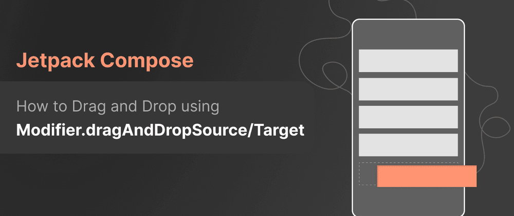
In January 2024, a significant Jetpack Compose update introduced dragAndDropSourceand dragAndDropTarget modifiers, simplifying drag-and-drop interactions compared to the manual approach I previously demonstrated.
You can check it out here.
Table of contents
- Background
- Let's Get Started
- Design Composable to Show Food Items
- Composable to Show Users
- Add Drag Source
- Add Drop Target
- Conclusion
Let’s Get Started
We’ll divide implementation into 4 simple steps to make each step easy to understand.
We’re using the same example of the original post. Let’s quickly have a look at our UI components.
- Design Composable to Show Food Items
fun FoodItemCard(foodItem: FoodItem) {
    Card(
        elevation = CardDefaults.elevatedCardElevation(defaultElevation = 10.dp),
        colors = CardDefaults.elevatedCardColors(
            containerColor = Color.White,
        ), shape = RoundedCornerShape(24.dp),
        modifier = Modifier.padding(8.dp)
    ) {
        Row(
            verticalAlignment = Alignment.CenterVertically,
            modifier = Modifier.padding(10.dp)
        ) {
            Image(
                painter = painterResource(id = foodItem.image),
                contentDescription = null,
                contentScale = ContentScale.Crop,
                modifier = Modifier
                    .size(130.dp)
                    .clip(RoundedCornerShape(16.dp))

            )

            Spacer(modifier = Modifier.width(20.dp))
            Column(modifier = Modifier.weight(1f)) {
                Text(
                    text = foodItem.name,
                    fontSize = 22.sp,
                    color = Color.DarkGray
                )
                Spacer(modifier = Modifier.height(6.dp))
                Text(
                    text = "$${foodItem.price}",
                    fontSize = 18.sp,
                    color = Color.Black,
                    fontWeight = FontWeight.ExtraBold
                )
            }
        }
    }
}

LazyColumn(
    modifier = Modifier.fillMaxSize(),
    contentPadding = PaddingValues(horizontal = 10.dp)
) {
    items(items = foodList) { food ->
        FoodItemCard(foodItem = food)
    }
}
Here's our Food item card.

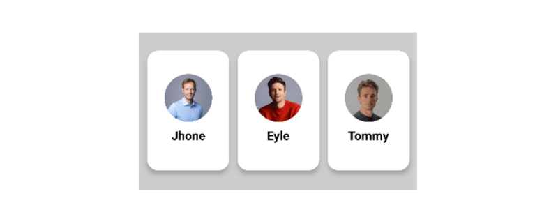
- Composable to Show Users
Now, Let’s add composable to show Persons, we’ll show the profile image and the person’s name on the card.
@Composable
fun PersonCard(person: Person) {
        Column(
            modifier = Modifier
                .padding(6.dp)
                .shadow(elevation = 4.dp, shape = RoundedCornerShape(16.dp))
                .width(width = 120.dp)
                .fillMaxHeight(0.8f)
                .background(Color.White, RoundedCornerShape(16.dp)),
            verticalArrangement = Arrangement.Center,
            horizontalAlignment = Alignment.CenterHorizontally
        ) {
            Image(
                painter = painterResource(id = person.profile), contentDescription = null,
                modifier = Modifier
                    .size(70.dp)
                    .clip(CircleShape),
                contentScale = ContentScale.Crop
            )
            Spacer(modifier = Modifier.height(10.dp))
            Text(
                text = person.name,
                fontSize = 18.sp,
                color = Color.Black,
                fontWeight = FontWeight.Bold
            )
        }
}

// To show a list of users
LazyRow(
    modifier = Modifier
        .fillMaxHeight(0.3f)
        .fillMaxWidth()
        .background(Color.LightGray, shape = RoundedCornerShape(topEnd = 10.dp, topStart = 10.dp))
        .padding(vertical = 10.dp)
        .align(Alignment.BottomCenter),
    verticalAlignment = Alignment.CenterVertically,
    horizontalArrangement = Arrangement.Center
) {
    items(items = persons) { person ->
        PersonCard(person)
    }
}
And here’s the result:
- Add Drag Source
Before we jump into implementation let’s have a quick look at the modifier
Modifier.dragAndDropSource
This Modifier in Jetpack Compose enables an element to become a source for drag-and-drop operations when applied to it.
@Composable
fun MyDraggableComponent() {
    Box(
        modifier = Modifier
            .size(100.dp)
            .background(Color.Blue)
            .dragAndDropSource(
                drawDragDecoration = {
                    // Provide visual representation of the dragged item
                }
            ) {
                // Logic to handle drag-and-drop operation
                startTransfer (/* data to transfer */ )
            }
    ) { /* Content of the draggable component*/ }
}
To read the full version, please visit Canopas Blog.
This blog post was originally published on Canopas.
Conclusion
In conclusion, the introduction of the dragAndDropTarget and dragAndDropSourcemodifiers in Jetpack Compose simplifies the addition of drag-and-drop features.
This streamlined process is a significant improvement over the previous method, showcasing Jetpack Compose's commitment to enhancing developer experiences.
Consider incorporating these modifiers into your projects for a more interactive and enjoyable user experience.
Happy coding! 🚀✨

Top comments (1)
This post explains how to use drag and drop in Jetpack Compose in a simple way. It’s great for learning how to move items around the screen easily. Perfect for beginners who want to make fun and interactive apps!